MoneySights Design Process
We wanted to create a product that not only took care of the users’ day-to-day tracking of money, but enabled sustained growth and stability. To do this we needed a feature set that would help the user view, understand, plan, manage, make decisions and take action on matters of personal finance. These in turn would help solve the user needs to take care of living expenses, having security, being stable, clearing liabilities, accumulating and growing assets, through till greater goals like retirement, financial freedom and legacy.
The design objectives were to have an interface that was,
- Fresh, clean, lightweight, frictionless & quick
- Persuasive, desirable & Invoked trust
- Scalable & consistent
- Information that was hierarchical, chunked & layered
- Non-essentials either hidden or removed
- Copy that was simple, concise & free of jargon
- Features & elements prioritized with visual hierarchy
- Colour and icon imagery to aid information and also break the monotony of text
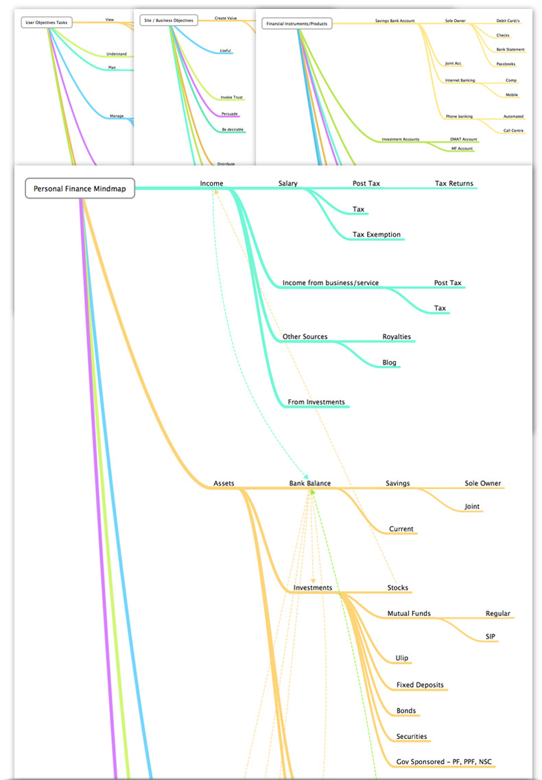
Mindmaps
Mindmaps that were used during the ideation process and helped build the Information architecture.
- Financial Products
- Personal Finance Mmap
- Site Objectives
- User Objectives - Tasks
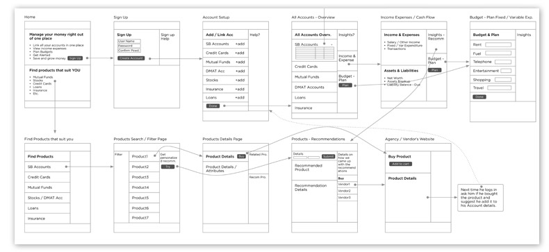
Flow Diagram
Flow diagram with simple pages with block level details. This gives the primary flow i.e. user registration and account setup some structure and also shows discovery of products. There will be different flow diagrams for other secondary and tertiary tasks.
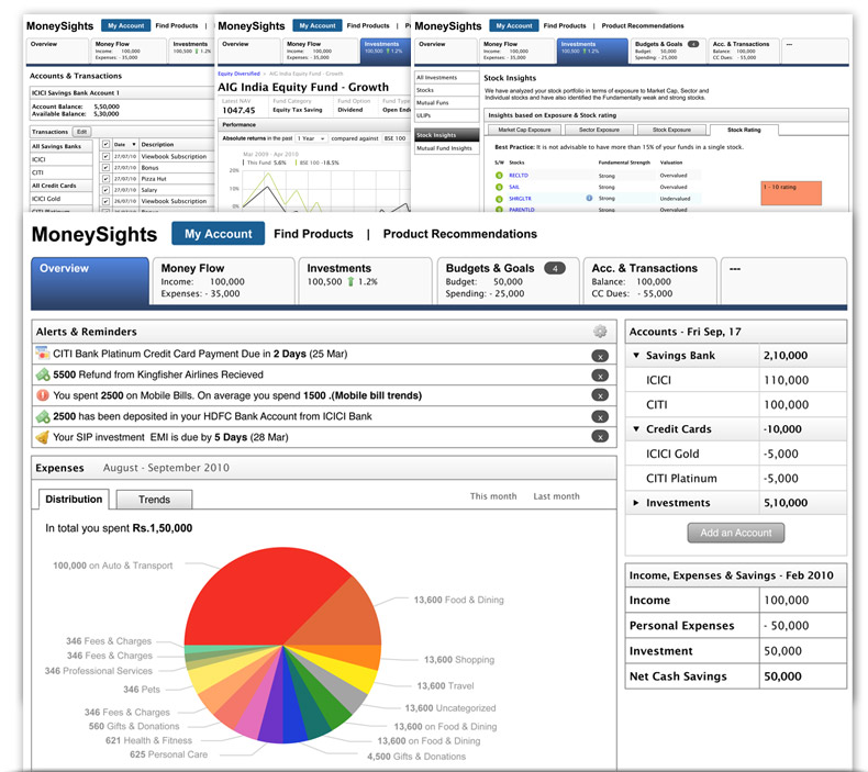
Wireframes
Wireframes - making concepts more concrete. More like a skeletion of the site without skinning. Helps validate task flows, basic layout; giving form to features that were abstract. Could be used to create low fidelity prototypes.
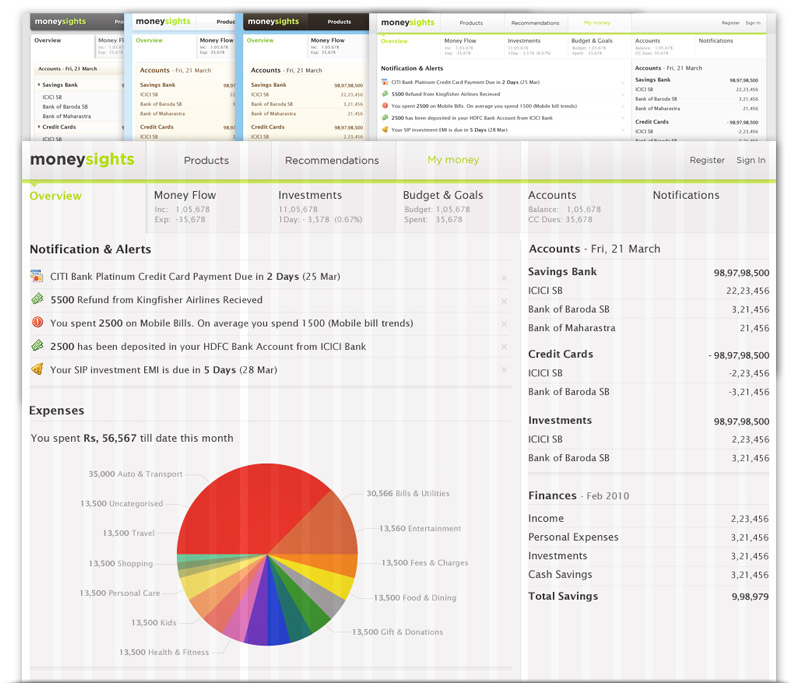
Visual Design
The subject of money gives most people an uncomfortable feeling, especially when it is about managing, transacting or investing it. So we wanted to give the product a feel that was refreshing, clean, lightweight and quick. Cool colours like blues and greens were used as the base colours since they’re soothing. Warmer colours like red, yellow and orange were used mostly on elements that needed to grab attention, like alerts, notifications and errors. Coloured elements and icon imagery to aid information and break the monotony.
- Grid based
- Visual layering
- Colour coding
- Cool base colours